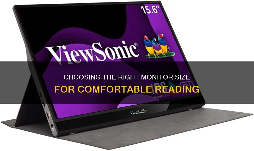
When it comes to reading text, the size of your monitor matters. A dependable, high-quality monitor is essential for reading documents in the digital age, when information is always at our fingertips. The best monitors for reading documents offer clear, sharp text, reduced eye strain, and a smooth transition between pages.
Resolution is key when it comes to reading text on a screen. A high-resolution monitor (1080p or more) ensures text is clear and crisp, reducing eye strain when reading for long periods. A bigger screen also helps to make reading easier and faster, with less squinting and straining to make out small text.
When it comes to screen size, bigger is usually better. A larger display provides more workspace and reading space, making it easier to have multiple documents open at once. The most common size comparison is between 24 and 27, with 27” being preferable if it suits your budget and desk space.
Other important factors to consider when choosing a monitor for reading text include panel type, brightness adjustment, eye care technologies, aspect ratio, ergonomic design, and reaction time.
| Characteristics | Values |
|---|---|
| Resolution | 1080p or more |
| Panel Type | IPS (In-Plane Switching) |
| Blue Light and Brightness Filters | Adjustable |
| Size | Bigger is better |
| Aspect Ratio | 16:9 |
| Ergonomic Design | Height, tilt and swivel adjustments |
| Reaction Time | 5 ms |
| Connectivity Options | DisplayPort, USB-C, HDMI |
What You'll Learn
- Resolution: 1080p or more to ensure text is clear and reduce eye strain
- Panel Type: IPS panels offer the best image quality and colour accuracy
- Blue Light and Brightness Filters: Adjustable filters reduce eye strain
- Size and Aspect Ratio: A bigger screen and a 16:9 aspect ratio for a more engaging reading experience
- Ergonomic Design: Height, tilt and swivel adjustments for a comfortable reading posture

Resolution: 1080p or more to ensure text is clear and reduce eye strain
Resolution is an important consideration when choosing a monitor for reading text. The most common resolution is 1920 x 1080p (Full HD), which is usually good enough for reading. However, higher resolutions can provide even more clarity, reducing eye strain and making text easier to read.
When choosing a monitor, it's important to consider the screen size in conjunction with the resolution. As the screen size increases, the resolution should also increase to ensure the image stays sharp. For example, for monitors over 27" in size, a resolution of 2560x1440p or 4K (3840 x 2160p) is recommended. This will ensure that text remains clear and easy to read, even on larger screens.
In addition to resolution, other factors such as panel type, brightness adjustment, and eye care technologies also contribute to a comfortable reading experience. IPS (In-Plane Switching) panels are recommended for optimal color accuracy and broad viewing perspectives. Blue light filters and adjustable brightness levels can also help reduce eye strain during extended reading periods.
Overall, choosing a monitor with a resolution of 1080p or higher will ensure clear and crisp text, reducing eye strain and improving the overall reading experience.
Activating FPS Mode on Your ASUS Monitor: A Step-by-Step Guide
You may want to see also

Panel Type: IPS panels offer the best image quality and colour accuracy
When it comes to choosing a monitor for reading text, there are several factors to consider, such as screen size, resolution, response time, brightness, and eye-care features. However, one crucial aspect that significantly impacts the reading experience is the panel type.
IPS (In-Plane Switching) panels offer superior image quality and colour accuracy compared to other types of panels. IPS panels provide improved contrast and brightness, delivering an image that appears more vivid and detailed. They also offer a wider range of viewing angles, ensuring that colours remain accurate and consistent even when viewed from different positions. This is especially beneficial if you frequently collaborate with others or need to adjust your sitting position throughout the day.
In addition to image quality, IPS panels typically have a more consistent white point, resulting in a more uniform display. While TN (Twisted Nematic) panels may exhibit shifts in colour temperature, particularly when viewed from different angles, IPS panels provide a more stable and consistent viewing experience. This consistency in colour reproduction can be crucial for professionals in creative fields, such as design and photography, where accurate colour representation is essential.
Although VA (Vertical Alignment) panels may offer stronger contrast and deeper blacks, IPS panels excel in overall image quality and colour accuracy. IPS panels are often the preferred choice for professionals who require precise colour reproduction and those who prioritise image quality and colour fidelity.
When selecting a monitor for reading text, it is important to consider not only the panel type but also other factors such as pixel density, screen surface, luminance adjustment range, and subpixel layout. Additionally, eye-care features like blue light filters, flicker-free screens, and ergonomic designs can further enhance your reading experience by reducing eye strain and improving comfort.
In conclusion, IPS panels offer enhanced image quality and colour accuracy, making them a recommended choice for users who prioritise colour fidelity and consistent viewing experiences when selecting a monitor for reading text.
Setting Up Triple Monitors: The Ultimate Guide for ASUS Users
You may want to see also

Blue Light and Brightness Filters: Adjustable filters reduce eye strain
Blue light is a part of the visible light spectrum with a wavelength of around 440 to 490 nanometers, with higher-energy blue light having a shorter wavelength of 400 to 440 nm. It is one of the highest-energy colours in the visible spectrum, and blue light exists even with colours that aren't blue. For example, the main source of blue light we see every day is the sun.
While blue light has its benefits, overexposure to it can cause several issues. Blue light suppresses the production of melatonin, a chemical that helps us sleep. This disrupts your natural sleep cycle, and you're likely to feel lethargic, irritable, and unproductive. Overexposure can also lead to negative side effects on our well-being, including headaches, eye strain, and fatigue.
Blue light from screens has been linked to several eye problems. According to an article from UC Davis, constant exposure to blue light over time can cause damage to the eye with vision problems like age-related macular degeneration and cataracts. However, the Canadian Association of Optometrists states that there is no clinical evidence that exposure to artificial high-energy blue light damages the eyes.
To combat the negative effects of blue light, monitor manufacturers include blue light filters to reduce the amount of blue light you're exposed to. These filters are also available as a setting on your operating system, such as Night Light on Windows or Night Shift on macOS. Additionally, there are third-party software options and blue light-blocking eyewear.
When choosing a monitor for reading text, it is important to consider one with features that reduce eye strain, such as blue light filters, flicker-free screens, anti-glare, ergonomic stands, and reader mode. A larger display, better image quality, and improved colour accuracy will also make reading text easier and faster.
How Multiple Monitors Affect CPU Usage and Performance
You may want to see also

Size and Aspect Ratio: A bigger screen and a 16:9 aspect ratio for a more engaging reading experience
When it comes to choosing a monitor for reading text, a bigger screen is generally better. A larger display means you can increase the text size, reducing eye strain and making it easier to read without squinting. A bigger screen also gives you more screen space to work with, allowing you to have multiple documents open side-by-side.
The ideal screen size for a monitor used primarily for reading text is at least 24", with 27" being preferable if your budget and desk space allow for it.
In addition to the size of the screen, the aspect ratio is another important consideration. The aspect ratio of a screen refers to its width and height, and it affects how content is displayed. The most common aspect ratio for monitors is 16:9, also known as widescreen or HD. This aspect ratio has become the standard for televisions and computer monitors since the early 21st century.
A 16:9 aspect ratio is excellent for video, but for reading text, it may be less than ideal. This is because the 16:9 ratio is wider than it is tall, which means that when you're reading text, you'll have to deal with constant line breaks. This can be distracting and make it more challenging to focus on the content.
However, a 16:9 aspect ratio can still offer benefits for reading text. For instance, the widescreen format can be useful if you want to have multiple tabs or programs open side-by-side. For example, writers can use one half of the screen for research and the other half for writing. Additionally, as it is the standard format, you'll have a wider range of products to choose from, and it may be more cost-effective.
So, while a bigger screen is generally preferable for reading text, the ideal aspect ratio may depend on your specific needs and preferences. If you primarily use your monitor for reading and want to minimize distractions, a different aspect ratio might be better. On the other hand, if you often need to refer to multiple sources or perform other tasks alongside reading, the 16:9 aspect ratio could be a good choice.
Standard Monitor Screw Sizes: Know the Right Fit
You may want to see also

Ergonomic Design: Height, tilt and swivel adjustments for a comfortable reading posture
When choosing a monitor for reading text, it is important to consider the ergonomic design of the monitor and how it can be adjusted to ensure a comfortable reading posture. Here are some key adjustments to look for:
Height Adjustments
Height adjustments are crucial to finding a comfortable reading posture. Ideally, you want the top of the monitor to be slightly below eye level. This will prevent you from hunching over or craning your neck to read the text. If the monitor is too low, you can raise it by adjusting its height or using a monitor stand. Conversely, if it is too high, lower it to the appropriate level.
Tilt Adjustments
Tilt adjustments allow you to change the angle of the monitor. For reading text, it is generally recommended to tilt the monitor back slightly, creating an angle of around 15-20 degrees. This helps to reduce glare and reflections, improving readability and reducing eye strain.
Swivel Adjustments
Swivel adjustments let you turn the monitor from side to side. While this may not directly impact your reading posture, it can be useful if you need to share your screen with others or quickly switch between different tasks that require different monitor orientations.
In addition to these adjustments, consider the following tips for a comfortable reading posture:
- Ensure your chair is adjusted to the correct height, allowing your feet to rest flat on the floor and your knees to be level with your hips.
- Maintain a straight spine, keeping your shoulders over your hips, to avoid back pain.
- Avoid tilting your neck and instead, move your eyes to read from line to line.
- Keep the room well-lit to avoid straining your eyes and maintain a good posture.
- Take frequent breaks, stretching and moving your body to avoid muscle strain and fatigue.
ViewSonic, ASUS, or AOC: Which Monitor Brand to Choose?
You may want to see also
Frequently asked questions
The right monitor for reading text will have anti-eye strain features, increase comfort, make reading faster and easier, and boost productivity.
Look for a monitor with a high resolution (1080p or more) to ensure text is clear and crisp, an IPS (In-Plane Switching) panel for optimal colour accuracy and broad viewing perspectives, and blue light and brightness filters that are adjustable.
For reading text, a bigger screen is generally better as it will be easier to read without straining your eyes. Monitor screen sizes vary from 20" to 40", with the most common sizes being 24" and 27". If you can afford it and have the space, a 27" monitor is recommended.
A standard widescreen monitor has a 16:9 aspect ratio, which is generally recommended for viewing documents. Ultrawide (21:9) and super ultrawide (32:9) screens are also available and can be useful if you want to have multiple tabs or programs open side-by-side.
In addition to size and aspect ratio, consider the resolution, panel type, brightness adjustment, and eye care technologies. It's also important to think about your budget and the connectivity options available on the monitor to ensure it can be easily connected to your devices.


