A histogram is a graph that represents the tones in an image: the highlights, the shadows, and everything in between. It is a useful tool for photographers to determine a photo's exposure accuracy and avoid errors. The left-hand side of a histogram graph corresponds with shadow detail, and the right-hand side corresponds with highlights. The middle section represents the mid-tones of the photo. A narrow histogram graph indicates low-contrast, while a wide graph indicates high-contrast. The histogram can be viewed on the camera's LCD screen or in the viewfinder, and it can also be accessed during post-processing in photo editing software. It is important to note that there is no single correct histogram shape as it varies with the subject and lighting conditions. By understanding how to read a histogram, photographers can make informed decisions about exposure settings and enhance their images.
| Characteristics | Values |
|---|---|
| Purpose | To determine a photo's exposure accuracy and avoid errors |
| Use | Can be used to check exposure before and after taking a photo |
| Data | Represents the tones in an image: highlights, shadows, and everything in between |
| Data Representation | Graph with the left side representing shadows and the right side representing highlights |
| Graph Peaks | Represent the number of pixels of a particular tone |
| Graph Skew | Indicates whether the photo is underexposed, overexposed, or well-exposed |
| Clipping | Indicates a loss of information, which is usually undesirable |
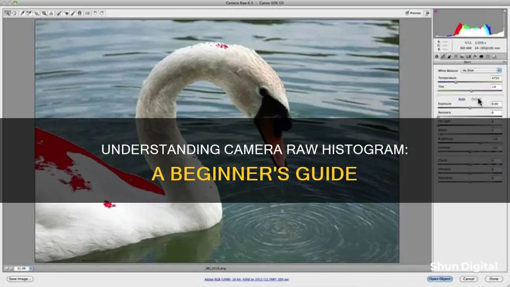
| Editing | Can be used in Lightroom and Camera Raw for image edits |
| File Format | Shooting in raw format maximizes editing options |
| Calibration | Monitor calibration may be needed to ensure accurate colours |
What You'll Learn
![]()
How to read a histogram step by step
A histogram is a graph that represents the tones in an image: the highlights, the shadows, and everything in between. It is a useful tool for photographers to understand exposure. Here is a step-by-step guide on how to read a histogram:
Step 1: Understanding the Basics
The left side of the histogram graph represents the blacks or shadows, the right side represents the highlights or bright areas, and the middle section represents the midtones of the photo. The graph peaks represent the number of pixels of a particular tone, with each peak corresponding to a different tonal value.
Step 2: Analyzing the Curve
Look at the overall curve of the graph. If the histogram is skewed to the right, it often indicates overexposure, as the shot is full of light pixels. If it is skewed to the left, it suggests underexposure, with a high volume of dark pixels. A balanced and centred histogram indicates a well-exposed image, with a good range of midtones.
Step 3: Checking for Clipping
Examine the ends of the histogram. If there are peaks pressed up against the edges of the graph, it indicates a loss of information. On the right side, there may be highlight clipping, and on the left, shadow clipping. This means that there are areas in the image that are completely white or black, with no detail.
Step 4: Evaluating Exposure
A well-exposed image will have a histogram that is balanced and spread across the graph, without edge peaks. If the histogram is skewed too far to the right or left, you may need to adjust your exposure settings. For example, if it is skewed to the right, you can reduce exposure by increasing the shutter speed.
Step 5: Understanding Scene Dynamics
Remember that different scenes will naturally have different histograms. For instance, a photo of a snowy landscape will have more details on the right side of the histogram, indicating more highlight detail. Trying to force a balanced histogram in such cases may result in an unnatural-looking image.
Step 6: Adjusting Settings
If you notice any clipping or exposure issues, you can adjust your camera settings accordingly. To reduce highlight clipping, you can decrease exposure by using a shorter shutter speed, narrowing your aperture, or lowering the ISO. To address shadow clipping, you can increase exposure by adjusting these settings in the opposite direction.
Step 7: Experimenting and Refining
Finally, remember that there is no single correct histogram shape. It will vary depending on the subject and lighting conditions. Experiment with different settings and scenes to understand how the histogram changes and how you can use it to achieve your desired results.
CR123A Batteries: How Long Do They Power Cameras?
You may want to see also
![]()
How to use a histogram to prevent overexposure and underexposure
A histogram is a graphical representation of the brightness and contrast of an image, and it can help you avoid overexposure and underexposure. It is a chart that shows the distribution of pixels in your image according to their luminance or brightness. The horizontal axis of the histogram ranges from black on the left to white on the right, and the vertical axis shows the number of pixels at each brightness level.
To avoid overexposure and underexposure, you can use the histogram to adjust your exposure settings. Here are some tips on how to do this:
- If you see high-frequency tones or peaks on the right side of the histogram, it indicates overexposure, meaning the highlight detail is washed out. In this case, you can reduce the amount of light reaching the sensor by using a faster shutter speed, a smaller aperture, a lower ISO, or a neutral density filter.
- If you see high-frequency tones or peaks on the left side of the histogram, it indicates underexposure, meaning the shadows are too dark and the details are lost. To fix this, increase the amount of light reaching the sensor by using a slower shutter speed, a wider aperture, a higher ISO, or a flash.
- A balanced histogram that covers most of the tonal range, without clipping or spiking at either end, indicates a well-exposed image.
- The histogram can be used in manual mode or with exposure compensation to adjust shutter speed, aperture, and ISO until a balanced histogram is achieved.
- The histogram can also be used in post-processing to fine-tune exposure using curves or levels tools.
- When shooting, use the histogram in conjunction with Live View to check your exposure before taking the image.
Night Owl Camera Batteries: How Long Do They Last?
You may want to see also
![]()
Histogram pitfalls and mistakes
Histograms are an incredibly useful tool for photographers, but they can also be misleading and problematic if relied on too heavily. Here are some common pitfalls and mistakes to avoid when using histograms:
- Not Using Them At All: One of the most common mistakes is not using histograms at all. Whether a professional or amateur photographer, understanding histograms and how they can help improve your photography is essential.
- Over-Reliance: While histograms are a great tool, over-reliance on them can be detrimental. Sometimes, the pursuit of a "perfect" histogram can lead to ruinous editing and frustration. It's important to remember that histograms are just one tool in your arsenal and should not be the sole determinant of your image's exposure.
- Misinterpreting Data: A skewed histogram does not always indicate underexposure or overexposure. The scene you are capturing may naturally be darker or lighter than middle gray, resulting in a skewed histogram even if all the details are captured correctly. For example, photographing a black rock against a night sky will result in a left-skewed histogram, while capturing a white tree against snow will push the histogram to the right.
- Creative Licence: There may be times when you intentionally overexpose or underexpose an image for creative reasons. In these cases, a "perfect" histogram is not the goal, and it's more important to trust your artistic vision and deliberately aim for a specific result.
- Dynamic Range Limitations: Occasionally, you may encounter scenes with both ultra-light and ultra-dark pixels that exceed your camera's dynamic range. In such cases, clipping may be unavoidable, and you'll need to use advanced techniques or post-processing to capture the full tonal range of the scene.
- Low Contrast: If your histogram frequencies are bunched up towards the middle with empty space at the edges, your photo may be lacking in contrast. This can be adjusted by deepening the midtones and increasing the dynamic range of your image using the Contrast, Clarity, and Sharpening sliders in post-processing software.
- Clipping: Clipping occurs when there is a loss of information in your image, resulting in a lack of detail. This is indicated by peaks pressed up against the left or right sides of the histogram. To fix this, adjust your shutter speed, aperture, or ISO to let in more or less light, depending on whether your blacks or whites are being clipped.
- Subject vs Background: In portraiture, the histogram for the entire image may not be as relevant as the histogram for the subject alone. Using tools like the Quick Selection Tool in Photoshop to select your subject and view their histogram separately can provide more meaningful data and prevent over-editing.
How Long to Charge Mobius Cameras Fully?
You may want to see also
![]()
How to adjust brightness in Lightroom CC
A histogram is a graph that represents the tones in an image: the highlights, the shadows, and everything in between. The left side of the graph represents the blacks or shadows, the right side represents the highlights or bright areas, and the middle section represents the midtones. The graph peaks represent the number of pixels of a particular tone.
In Lightroom, you can find the histogram at the top of the right-hand panel. If your shadows are clipped, the gray triangle in the left corner of the histogram will turn white. Click the triangle or tap the J key to show shadow clipping, and the clipped shadows will turn blue so you can see them in the photo. If your highlights are clipped, the triangle in the top right corner will turn white. Click this triangle or tap J to see the lost highlight detail, which will be coloured red. Depending on what you find, you can adjust the exposure or contrast as needed.
If you want to adjust the brightness in Lightroom without using the exposure slider, you can use the curves adjustment. First, make sure you are using the point curve rather than the parametric curve. The point curve lets you add points to the curve and adjust them, while the parametric curve has sliders underneath. To switch between the two, click the button on the bottom right of the curves panel.
Now, to adjust brightness, simply click on the curve in the curves tool, right in the exact centre of the curve to create a point. Now drag this up to increase brightness, or down to decrease brightness.
Freeing Stuck Batteries in Pentax Cameras
You may want to see also
![]()
How to read a luminance histogram
A luminance histogram is a graph that represents the tones in an image: the highlights, the shadows, and everything in between. It is more accurate than an RGB histogram at describing the perceived brightness distribution or "luminosity" within an image. This is because it takes into account the fact that the human eye is more sensitive to green light than red or blue light.
The horizontal axis of a luminance histogram represents the range of tones from black on the left to white on the right. The higher the graph at any point, the greater the number of pixels with that tone – or, to put it another way, the larger the area of that tone in the image. The graph shows the relative number of pixels rather than the absolute value. The more the graph skews towards the right-hand side, the brighter the image or the subject. Conversely, if the graph peaks towards the left, you are either photographing a very low-key subject or the image is underexposed.
A luminance histogram is typically the default histogram your camera will present you with. It is displayed as either a white or black graph, and sometimes a grey graph within editing programs.
A luminance histogram with a spike touching either the left or right end indicates clipping, meaning you've lost some details in your photo. Clipping occurs when areas of your photo become too dark or too light for your camera's sensor to register any detail. The result is usually a flat mass of black or white in your photo, and an inability to salvage any apparent details, even through editing.
A well-exposed image will have a histogram that tails off at both the shadow (left) and highlight (right) ends, indicating that neither the darkest nor the brightest areas are being clipped.
A luminance histogram is more useful for judging the exposure of your image than an RGB histogram, unless you are shooting a very vibrant and colourful subject where you could easily clip one or more of the colour channels even if the overall exposure looks satisfactory.
Cleaning Corroded Camera Battery Contacts: DIY Guide
You may want to see also
Frequently asked questions
A histogram is a graph that represents the tones in an image: the highlights, the shadows, and everything in between.
The luminance histogram is a white bar graph that represents the tonal values in your image on a scale of zero to 255. The left-hand side of the histogram represents the darkest tones, and the right-hand side the lightest tones.
The left-hand side of a histogram graph corresponds with shadow detail, and the right-hand side with highlights. A left-skewed histogram often indicates underexposure, while a right-skewed histogram often indicates overexposure.
If all your tones are packed into one area of your histogram and there's a lot of space on either side, the contrast may be too low.
"UniWB" stands for "Unity White Balance". It is a situation in which the white balance coefficients are all nearly one, and the camera is not favouring any primary colour over another.